The existing design system was broken
The existing design system was broken
The existing design system was broken

⚠️ Old & outdated
⚠️ Old & outdated
⚠️ Old & outdated
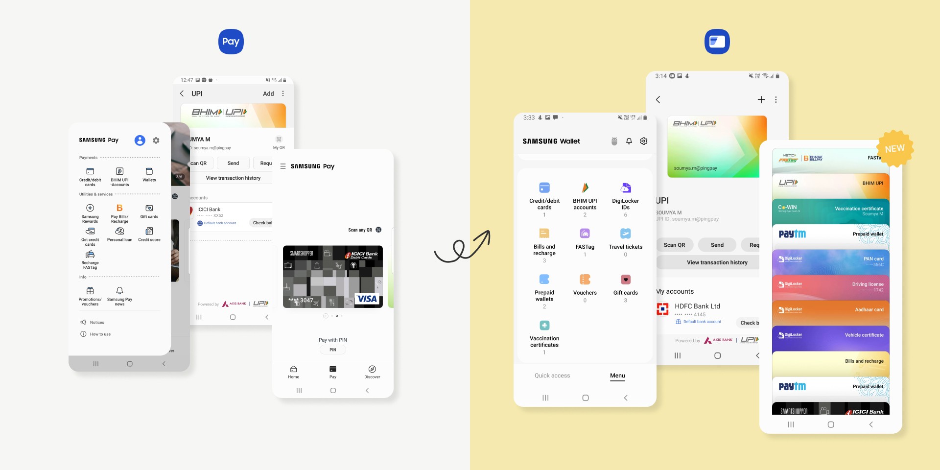
The Samsung Pay design system had poor version control. There was a mix of old screens from previous OneUI versions and new ones being added to the same design file.
The Samsung Pay design system had poor version control. There was a mix of old screens from previous OneUI versions and new ones being added to the same design file.
The Samsung Pay design system had poor version control. There was a mix of old screens from previous OneUI versions and new ones being added to the same design file.
🎢 Complex
🎢 Complex
🎢 Complex
With 400+ screens, 6+ feature modules, and 5+ design libraries, the system was complex and had dependencies. It was difficult to make changes without the fear of breaking stuff.
With 400+ screens, 6+ feature modules, and 5+ design libraries, the system was complex and had dependencies. It was difficult to make changes without the fear of breaking stuff.
With 400+ screens, 6+ feature modules, and 5+ design libraries, the system was complex and had dependencies. It was difficult to make changes without the fear of breaking stuff.
🐌 Slow as a slug
🐌 Slow as a slug
🐌 Slow as a slug
Samsung Pay design system was in one single file. This frequently led to software crashes due to the size of the (ever-growing) file. Sometimes progress would be lost due to the crashes.
Samsung Pay design system was in one single file. This frequently led to software crashes due to the size of the (ever-growing) file. Sometimes progress would be lost due to the crashes.
Samsung Pay design system was in one single file. This frequently led to software crashes due to the size of the (ever-growing) file. Sometimes progress would be lost due to the crashes.
❌ Inconsistent
❌ Inconsistent
❌ Inconsistent
There was no uniformity in the naming convention as the file had changed hands often, making it difficult for anybody to read or scan the file quickly to understand the navigation and how it is structured.
There was no uniformity in the naming convention as the file had changed hands often, making it difficult for anybody to read or scan the file quickly to understand the navigation and how it is structured.
There was no uniformity in the naming convention as the file had changed hands often, making it difficult for anybody to read or scan the file quickly to understand the navigation and how it is structured.
analysis
analysis
analysis
UX team did a deep dive to identify changes
UX team did a deep dive to identify changes
UX team did a deep dive to identify changes
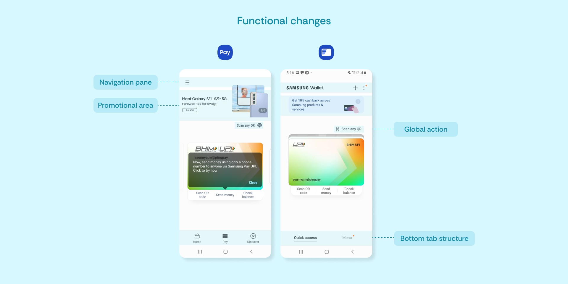
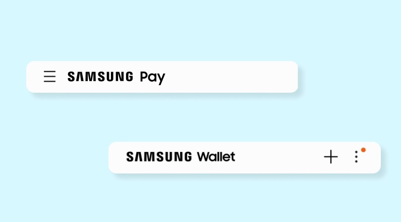
Navigation pane
Navigation pane
Navigation pane
Hamburger menu, which served as the launch point for many features and value-added services (VAS), was removed
Add button and Kebab menu were added for additional actions
✗ Critical features nested 1-2 levels deep
✗ Discoverability of features impacted
Hamburger menu, which served as the launch point for many features and value-added services (VAS), was removed
Add button and Kebab menu were added for additional actions
✗ Critical features nested 1-2 levels deep
✗ Discoverability of features impacted
Hamburger menu, which served as the launch point for many features and value-added services (VAS), was removed
Add button and Kebab menu were added for additional actions
✗ Critical features nested 1-2 levels deep
✗ Discoverability of features impacted

Promotional area
Promotional area
Promotional area
Third-party ad area removed
Replaced with in-app promotions
✓ Promotions not hampered
✓ More organic traffic within the app
Third-party ad area removed
Replaced with in-app promotions
✓ Promotions not hampered
✓ More organic traffic within the app
Third-party ad area removed
Replaced with in-app promotions
✓ Promotions not hampered
✓ More organic traffic within the app

Global actions
Global actions
Global actions
Frequently accessed buttons like Scan QR moved right above the card area
✓ Closer to the thumb
✓ Improved ease of access
Frequently accessed buttons like Scan QR moved right above the card area
✓ Closer to the thumb
✓ Improved ease of access
Frequently accessed buttons like Scan QR moved right above the card area
✓ Closer to the thumb
✓ Improved ease of access

Bottom tab navigation
Bottom tab navigation
Bottom tab navigation
3 tab structure changed to 2 tabs with new names
✓ Reduced clutter
✓ Cleaner interface
✗ Learning curve for user
3 tab structure changed to 2 tabs with new names
✓ Reduced clutter
✓ Cleaner interface
✗ Learning curve for user
3 tab structure changed to 2 tabs with new names
✓ Reduced clutter
✓ Cleaner interface
✗ Learning curve for user


Button style
Button style
Button style
Text buttons like 'Add' changed to symbol icons ('+')
Outline buttons changed to rounded buttons
✓ Improved accessibility
✗ Discoverability of add flow hampered
Text buttons like 'Add' changed to symbol icons ('+')
Outline buttons changed to rounded buttons
✓ Improved accessibility
✗ Discoverability of add flow hampered
Text buttons like 'Add' changed to symbol icons ('+')
Outline buttons changed to rounded buttons
✓ Improved accessibility
✗ Discoverability of add flow hampered

Layout and chunking
Layout and chunking
Layout and chunking
List view changed to card format in chunking style
✓ Increased affordance
✓ More white space to minimize errors
✗ Critical information hidden below the fold
✗ Discoverability of accounts hampered
List view changed to card format in chunking style
✓ Increased affordance
✓ More white space to minimize errors
✗ Critical information hidden below the fold
✗ Discoverability of accounts hampered
List view changed to card format in chunking style
✓ Increased affordance
✓ More white space to minimize errors
✗ Critical information hidden below the fold
✗ Discoverability of accounts hampered

Card preview
Card preview
Card preview
Enlarged card shown upfront
✓ Facilitates quick recognition
✗ Page goes into long scroll, key actions hidden beneath the fold
Enlarged card shown upfront
✓ Facilitates quick recognition
✗ Page goes into long scroll, key actions hidden beneath the fold
Enlarged card shown upfront
✓ Facilitates quick recognition
✗ Page goes into long scroll, key actions hidden beneath the fold

Fonts and icons
Fonts and icons
Fonts and icons
Font weights updated
Icons made bigger
✓ Improved scannability
✓ Improved accessibility
Font weights updated
Icons made bigger
✓ Improved scannability
✓ Improved accessibility
Font weights updated
Icons made bigger
✓ Improved scannability
✓ Improved accessibility
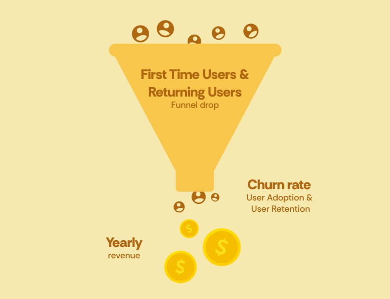
The new interactions posed a risk to the existing KPIs
The new interactions posed a risk to the existing KPIs
The new interactions posed a risk to the existing KPIs
One extra tap?!
The Details page was one of the key entry points to critical actions that were driving our KPIs. Wallet was introducing an additional tap action to get to the Details page. We anticipated significant drop-offs at this point. That was not good news for the Product or Business teams (even UX — where is the UX if we've got no U).

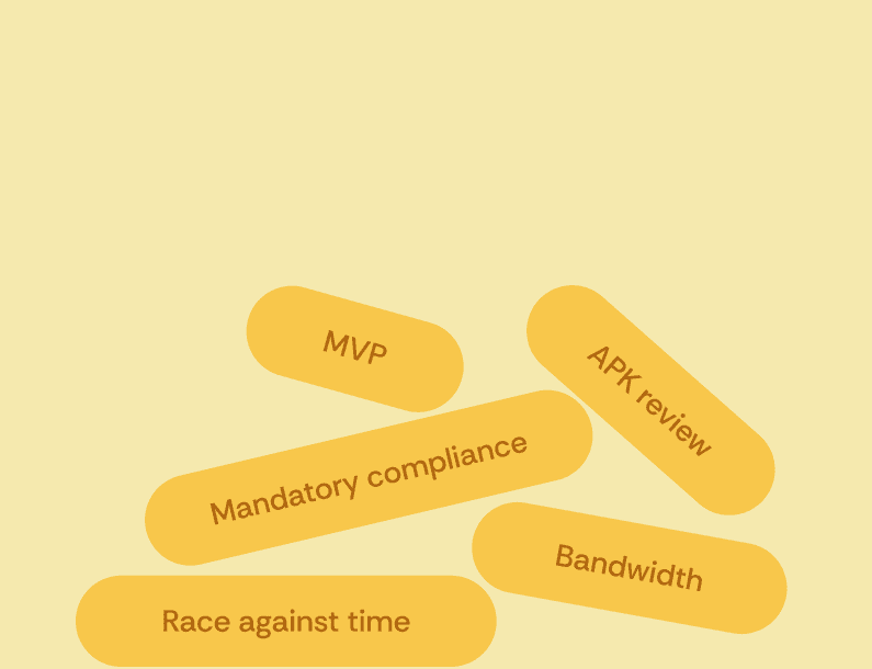
CHALLENGE(S)
CHALLENGE(S)
CHALLENGE(S)
Biz goals + legal compliance + dev effort + maintaining metrics = Challenge City!
Biz goals + legal compliance + dev effort + maintaining metrics = Challenge City!
Biz goals + legal compliance + dev effort + maintaining metrics = Challenge City!
While the product and business teams were concerned about the performance and potential churn rate, the UX team had to juggle between convincing HQ about design decisions for India market with dynamically changing global guidelines and delivering ongoing compliance requirements.
While the product and business teams were concerned about the performance and potential churn rate, the UX team had to juggle between convincing HQ about design decisions for India market with dynamically changing global guidelines and delivering ongoing compliance requirements.
While the product and business teams were concerned about the performance and potential churn rate, the UX team had to juggle between convincing HQ about design decisions for India market with dynamically changing global guidelines and delivering ongoing compliance requirements.
Product challenge
Product challenge
Product challenge
The structural changes meant critical actions with high KPIs were going to be affected. Key feature pages were nested 1-2 levels deeper, which meant discoverability was going to be hampered drastically.
The structural changes meant critical actions with high KPIs were going to be affected. Key feature pages were nested 1-2 levels deeper, which meant discoverability was going to be hampered drastically.
The structural changes meant critical actions with high KPIs were going to be affected. Key feature pages were nested 1-2 levels deeper, which meant discoverability was going to be hampered drastically.
Engineering challenge
Engineering challenge
Engineering challenge
A major chunk of the code was global, which meant we were looking at minimum deviation to avoid rework. Engineering team also had to balance compliance requirements in parallel.
A major chunk of the code was global, which meant we were looking at minimum deviation to avoid rework. Engineering team also had to balance compliance requirements in parallel.
A major chunk of the code was global, which meant we were looking at minimum deviation to avoid rework. Engineering team also had to balance compliance requirements in parallel.
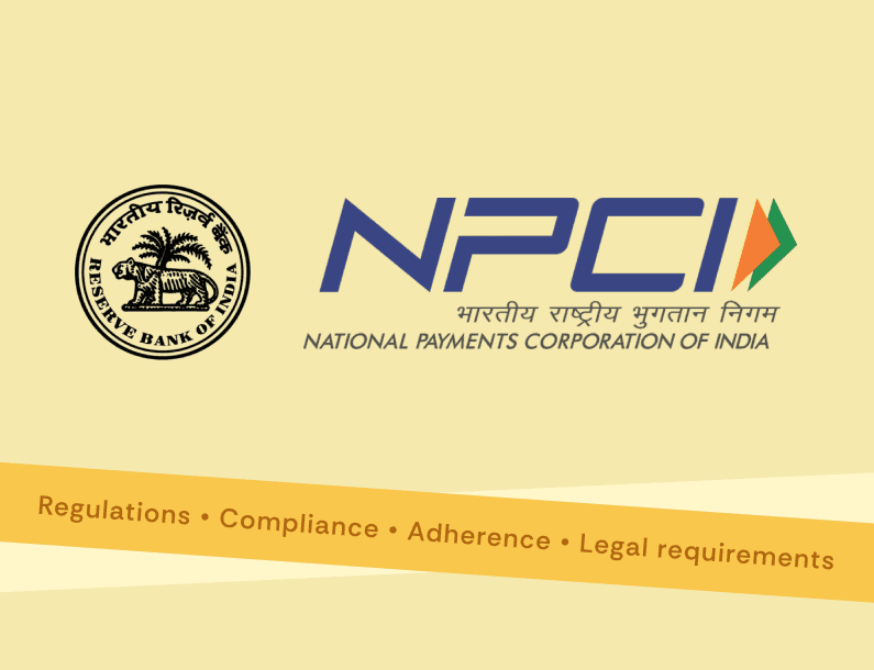
Business/Legal challenge
Business/Legal challenge
Business/Legal challenge
Samsung Pay had business-as-usual requirements going on, that had to be implemented along with mandatory regulatory compliance.
Samsung Pay had business-as-usual requirements going on, that had to be implemented along with mandatory regulatory compliance.
Samsung Pay had business-as-usual requirements going on, that had to be implemented along with mandatory regulatory compliance.
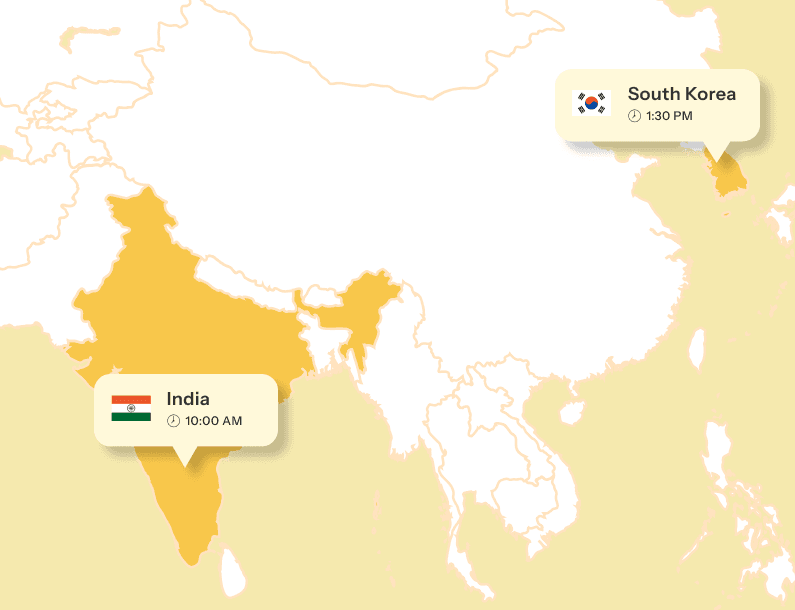
HQ challenge
HQ challenge
HQ challenge
We were a distributed team operating out of Bangalore, Delhi and South Korea. HQ was 3.5 hours ahead of us, so we had to ensure all our mails and pitch decks were sent early on to get timely responses.
We were a distributed team operating out of Bangalore, Delhi and South Korea. HQ was 3.5 hours ahead of us, so we had to ensure all our mails and pitch decks were sent early on to get timely responses.
We were a distributed team operating out of Bangalore, Delhi and South Korea. HQ was 3.5 hours ahead of us, so we had to ensure all our mails and pitch decks were sent early on to get timely responses.
design directions
design directions
design directions
There were 3 distinct UX approaches… and trade-offs
There were 3 distinct UX approaches… and trade-offs
There were 3 distinct UX approaches… and trade-offs
I led the creation of the analysis document highlighting the possible approaches, next steps, pros and cons along with implications. We had to narrow down the approach keeping in mind various factors:
- Consistency with global flows (HQ alignment)
- Dependencies on global code and development effort required (Dev constraint)
- Minimal impact on existing KPIs (Biz impact)
- Critical feature discoverability and access (Product team pain point)
- Time needed to deliver the UI design guides (UX bandwidth)
All of this, while NOT compromising on end user experience.
The meeting rooms witnessed a couple of heated discussions (rightly named 'War Rooms').


A hybrid approach was chosen
A hybrid approach was chosen
A hybrid approach was chosen
Approach A: Follow global principle as is
This would be consistent with the global Wallet philosophy and global flows.
On the flipside, it meant more development effort to create list view pages for internal features that previously didn't exist. Extra tap meant more analytics and potential funnel drops. Critical features would be impacted which in turn meant fall in revenue. No team was okay with this.
Approach B: Follow global wherever required, India delta for critical features
A middle ground between two extremes.
While we agreed with HQ that list view made sense to some of the features that had a real life card equivalent, critical feature modules like UPI and Bills and recharge could directly lead users to the Detail view so as to not hamper the discoverability.
Approach C: Follow existing Pay principle
This would be familiar to existing Pay users with no learning curve.
However, Wallet was all about catering to premium user base. When the rest of the globe is following the latest OneUI structure and got an upgrade from Pay to Wallet, it didn't quite make sense to leave Indian users behind. Retaining Pay flow meant suboptimal and outdated experience.
Outcome:
All teams unanimously agreed that approach B was the way to go.
strategy
strategy
strategy
Prioritising critical feature modules
Prioritising critical feature modules
Prioritising critical feature modules
We had multiple rounds of stakeholder workshops to align on the order, criticality and priority of feature release. Each team called out risks and implications on the timeline.
[UX] Common screens:
Some of the modules like Bills and recharge, FASTag, and Prepaid wallets shared payment flows and screens from UPI module. We proposed to bump up UPI to high priority since
a) it was a critical India feature
b) it had cascading dependencies across other modules
[Product] Upcoming partnerships:
Some modules were in talks for partnerships and expanding the offerings, which meant — wait for it — more changes! The last thing that any team wanted to hear at that point was 'change'. Such modules were kept as moderate priority. They were to be taken up once we had enough clarity about their roadmap.
[Engineering] Effort and feasibility:
Any minor deviation from global flows meant development effort max. Involving the engineering team in our discussions helped us get a better understanding of the constraints we were operating on, and set the boundaries within which to propose new suggestions.
Outcome:
The modules that were most at stake were kept at a high priority while the ones which had not changed for a long time and did not have any foreseeable requirement in future were moved to the bottom of the priority list.

timeline
timeline
timeline
The timeline in a nutshell:
Analyse, prioritise, align, execute, launch!
The timeline in a nutshell:
Analyse, prioritise, align, execute, launch!
The timeline in a nutshell:
Analyse, prioritise, align, execute, launch!
The stakeholders (and stars) aligned, much to our delight, and we started the mammoth task of transition. Execution involved taking the entire Samsung Pay design system and transforming it into a brand new Samsung Wallet design system, screen by screen.
Outcome:
UI design specification document for dev hand-off that showcased every user flow, screen, interaction, errors and edge cases, right down to the last detail. Every aspect, including the dialog boxes, copy, information hierarchy, was created in accordance with OneUI4.X guidelines.
A lot of coffee was gulped down in the process.

IMPACT
IMPACT
IMPACT
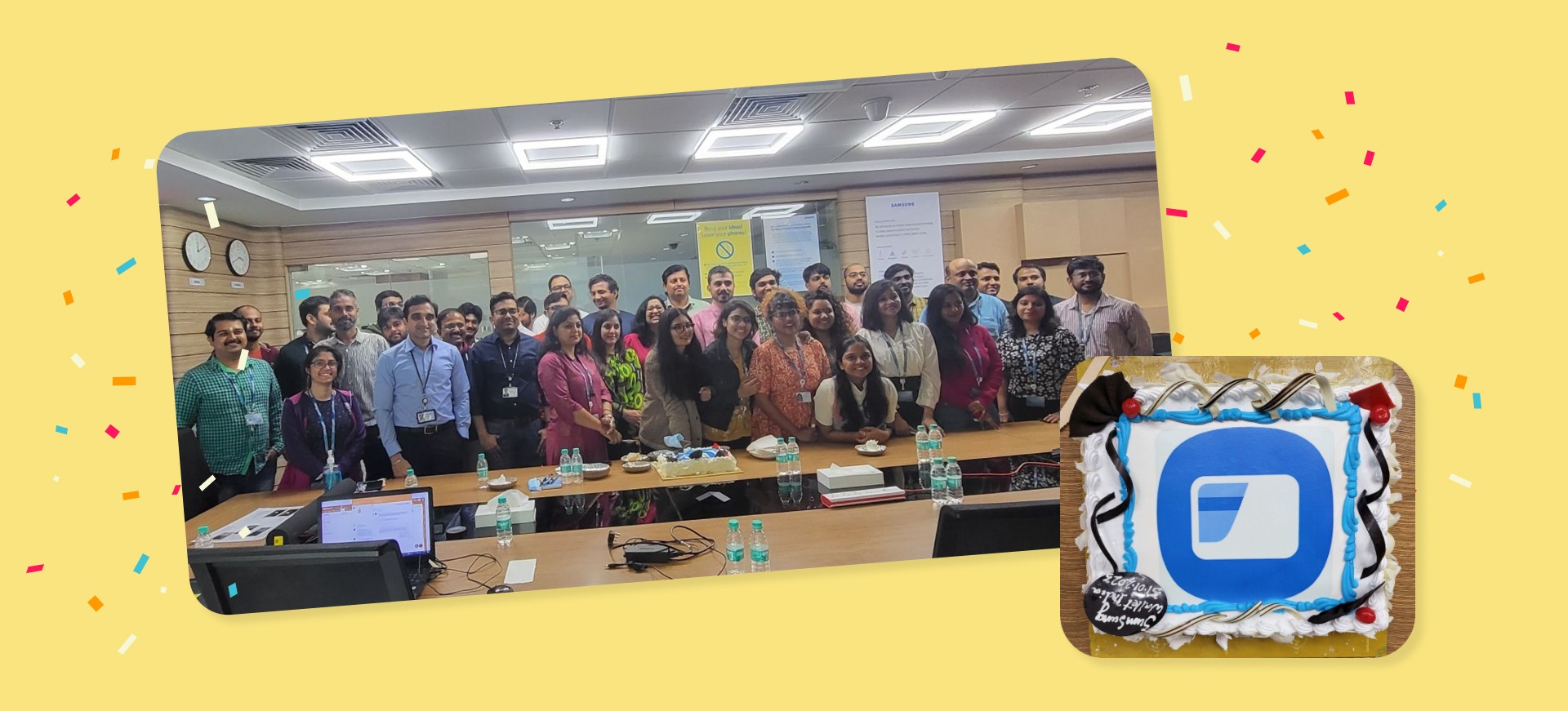
Samsung Wallet successfully launched in India
Samsung Wallet successfully launched in India
Samsung Wallet successfully launched in India
Now that you know the BTS (Blood, Sweat and Tears) that went down, we hope you will enjoy the experience of having convenience right at your fingertips (full brownie points if you are able to spot me).
Now that you know the BTS (Blood, Sweat and Tears) that went down, we hope you will enjoy the experience of having convenience right at your fingertips (full brownie points if you are able to spot me).
Now that you know the BTS (Blood, Sweat and Tears) that went down, we hope you will enjoy the experience of having convenience right at your fingertips (full brownie points if you are able to spot me).